
Built around the barber.
Clear about the business.
A product website that brings booking, client conversations, and the shop day into one story. A distinctive identity, detailed product journeys, and useful tools for the people behind the chair.
Tell us what you’re building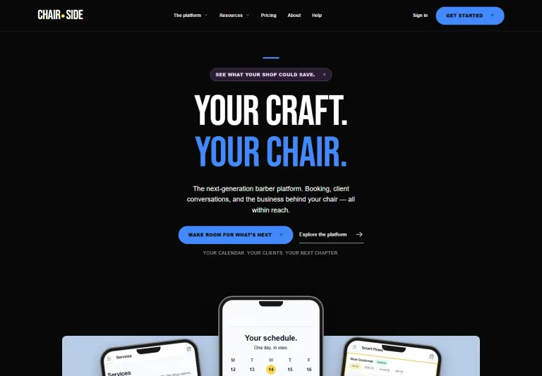
Booking, calendar, and Smart Flows explained through everyday shop workflows.
Interactive pricing and planning tools that let visitors explore their own numbers.
A consistent visual language across the homepage, feature pages, and guides.
A platform with range.
A story with focus.
Chairside brings together the work around the appointment: booking, schedules, services, client communication, and the business behind the chair. The website needed to make those connections easy to understand.
We built the narrative around the barber’s day. Each chapter starts with a recognizable need, then connects it to a specific workflow and a useful next step.
Your schedule. Your clients. Your next chapter.
A voice with a point of view.
Direct headlines and language drawn from the shop give the product a recognizable personality. The visitor stays at the center of the story.
A visual system with energy.
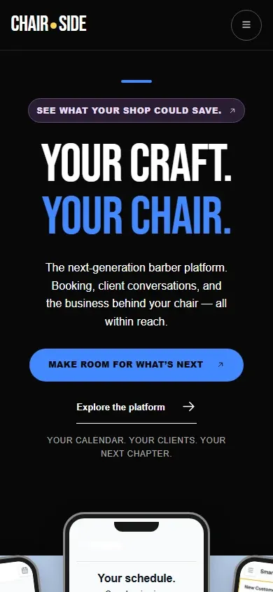
Condensed display type, black and cream surfaces, and electric blue accents create a clear rhythm. Product screens and phone compositions bring the workflow into view.
Show the work.
Connect the steps.
The homepage gives visitors the big picture. Dedicated pages then explain online booking and Smart Flows in more detail, using product imagery, focused sections, and links to related capabilities.
From finding a time
to knowing what happens next.
The booking page follows the client’s choices: a barber, a service, an available time, and the details of the visit. That sequence makes a broad capability feel concrete.
The follow-up
follows the moment.
Smart Flows gets its own story: an appointment event, a message, and the timing that connects them. The page explains the workflow through familiar confirmations, reminders, and follow-ups.
Let visitors explore
their own questions.
Pricing and planning are part of understanding a product. We gave those questions room on the website, with interactive tools alongside the explanation of Chairside’s token model.
Make the numbers
easier to work through.
Visitors can explore the pricing model, compare assumptions, and consider SMS, AI, and website-hosting usage. The website gives the commercial details a clear home.
What does an
empty chair cost?
The no-show calculator uses a visitor’s service price and missed appointments to estimate appointment value. It gives the question a concrete starting point without promising recovered revenue.
Keep the next
useful step close.
A topic filter helps visitors browse the guide library. Product pages, workflow explanations, and resources connect back to one another so the site can support a deeper evaluation.
A connected website
for a connected workday.
The result is a coherent product website: a strong opening, focused feature stories, useful decision tools, and a library that lets visitors go deeper. Desktop and mobile share the same voice and clear routes into the product.
The design makes room for both a first impression and a closer look. A visitor can understand the promise, inspect a workflow, explore pricing, and choose the next step.
- Product narrative
- Visual design
- Responsive development
- Feature storytelling
- Interactive tools
- Resource navigation
Next: Perrotta Built.
Explore the case studyWhat could your website
do for your business?
Tell us what you’re building. We’ll help you shape a website around the people you want to reach.
Tell us about your website