Feeling Blue?
Let's talk about what using different shades of blue says about your website and your business.

Understanding the Psychology
Before you decide on what colors and color palette you're using for your website, it's important to understand color psychology and how it impacts the way people will view your website and your business. Color psychology is the study of color as a determinant of human behavior. Different colors can seriously influence a person's perception of the thing they're looking at, and can even evoke different emotions.
Understanding the Effect
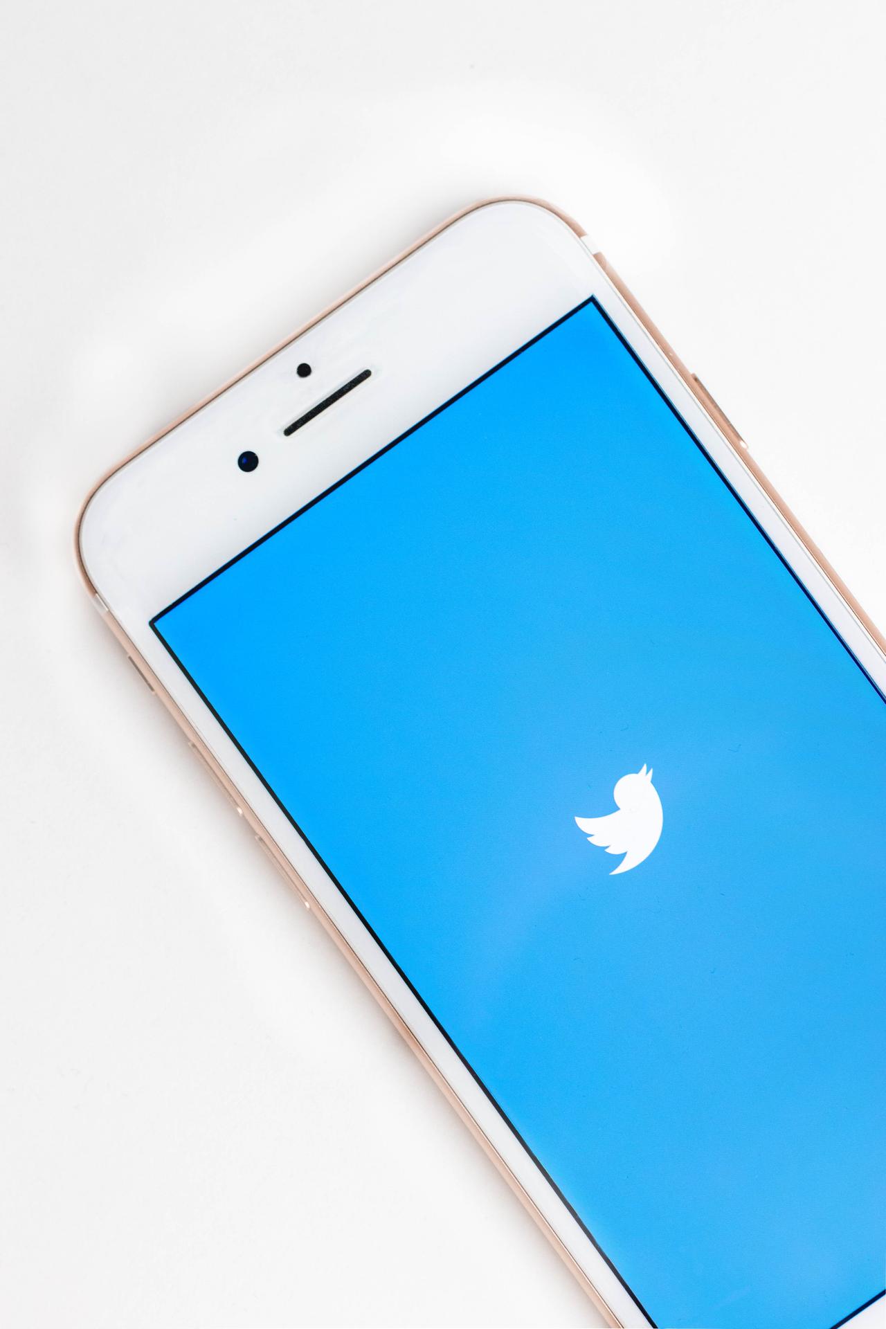
You'll probably have noticed that a lot of big-name companies, like Twitter and Facebook, have incorporated blue into their website's color scheme. This isn't a coincidence. Blue offers the best of both worlds, helping convey professionalism on a website while simultaneously evoking an "earthy," calming feeling due to it's association with the sky and water.
Twitter and Facebook are both tech and social media platforms. It's important that the colors used on their websites convey each aspect of their business successfully. Using the color blue helps them do just that, maintaining a clean, tech vibe while also evoking a calm feeling that allows people to feel more open in sharing their ideas and thoughts via social media.

Using Blue on a Vitris Site
We've used blue within the color palette of a lot of Vitris built websites. It's perfect for service-based, local business because it helps to deliver a professional message while maintaining a friendly and communal feeling.
Perfect Choice Cleaning Services is a wonderful example of using blue effectively on a website. The website uses blue for all of it's call to action buttons ("Book a Consultation," "Learn More," etc.) because of the color's ability to make people feel comfortable and want to engage with the site.